Author Topic: Taking better screen shots  (Read 78123 times)

Offline templesmom

  • Townie
  • ***
  • Posts: 166
  • Happy Simming!
Taking better screen shots
« on: October 11, 2010, 12:54:54 PM »
Is there a guide to helping you take better screen shots? I want to write a story but can't stand my screenshots and I end up not doing a story. I have trouble with getting the camera in the place I want and also getting close enough. I am sure the graphics level matters but I can't do much about that and still have my game run the way I want it to. Thanks in advance.

Offline Metropolis Man

  • Administrator
  • Watcher
  • ******
  • Posts: 11529
Re: Taking better screen shots
« Reply #1 on: October 11, 2010, 01:15:14 PM »
Look through the Dynasty stories and see the kinds of shots that players take. Pam is renowned for her screenshots so that's a good starting point. She's taught me a lot simply by me paying attention to how she does things.

If there's one piece of advice I would give it's get close. Fiddling with the camera can be a pain to get the exact angle and distance you want, but you do want to be pretty close. A Sims' expression isn't really obvious unless you're pretty close anyway—and good expressions really can make the difference between a so-so screenshot and a good screenshot.

The vast majority of screenshots on the forum are run-of-the mill screenshots...and I'll be the first to raise my hand in supplying many of those. :) So, get creative. Think of showing a Sim going into labor from different angles. And there's nothing wrong with staging set-ups. What I mean is creating special situations/placements just for the screenshot. Heck, the vast majority of my Dynasty photos are examples of that technique — i.e. moving Agnes' ice sculpture around like she's spying on the Sims.

EDIT: I went into my Dynasty game and took two screenshots — both of the same moment in time for my guitarist. The first screenshot below is your standard View My Sim angle — looking down on the action from a medium ranged distance. This is often the orientation I use when issuing commands to multiple Sims in a house because I can see everyone. But, the angle and distance for the screenshot turns this into a ho-hum photo — nothing special.


The photo below is a vast improvement because I got down on eye level and moved in closer to the action. But, honestly I still just rate this as "good" and not "really good" because of the lighting. The fact that this is taken at night with very little available light hides the Sims' expressions. Night shots are definitely good sometimes, especially if you're trying to convey emotion — like a romantic kiss, etc. But, a daytime shot will almost always be better than a nighttime shot because you can simply see more of what's going on.


Registered members do not see ads on this Forum. Register here.

Offline gerrr00

  • Immortal
  • *****
  • Posts: 626
Re: Taking better screen shots
« Reply #2 on: October 11, 2010, 02:02:56 PM »
You should also use tab.  From there you can get as close or whatever angle you want and it will look good.  You can still use the keyboard commands (`,1,2,3,4) to pause/play when you are in 'tab' view.  It does take some practice.  You can use the arrow keys, and < > keys to move around without the mouse.  I find better control using the keyboard over the mouse.   I think z and m are for zooming, I just use the wheel on my mouse for zoom though.  Good luck.
Ignorance is not an excuse, please read the forum rules.

Offline templesmom

  • Townie
  • ***
  • Posts: 166
  • Happy Simming!
Re: Taking better screen shots
« Reply #3 on: October 11, 2010, 04:10:51 PM »
Thanks both for the tips. I love the dynasty stories and Pams pictures, that is why I feel so not good about screen shots, but I guess I can't compare them to Pams or I'll never get a story started  ;D
I'll try out the tab key, I knew there was something I wasn't utilizing.

Bryndis

  • Guest
Re: Taking better screen shots
« Reply #4 on: October 11, 2010, 04:21:59 PM »
I love the advice for screenshots--I definitely spend ages getting just the right angle-- but any recommendations for hosting a blog dedicated to the sims 3?  There's wordpress, blogger, livejournal... So far I'm thinking blogger is the LEAST complicated.

Offline wildredchild

  • Immortal
  • *****
  • Posts: 791
  • Meet Sadie :)
Re: Taking better screen shots
« Reply #5 on: October 11, 2010, 05:30:37 PM »
I love the advice for screenshots--I definitely spend ages getting just the right angle-- but any recommendations for hosting a blog dedicated to the sims 3?  There's wordpress, blogger, livejournal... So far I'm thinking blogger is the LEAST complicated.

My personal suggestion is whatever feels right for you.  If you find blogger to be the least complicated, then use that one.

Offline malteser60

  • Occult
  • ****
  • Posts: 467
Re: Taking better screen shots
« Reply #6 on: October 11, 2010, 07:01:23 PM »
I'm not that great at taking screenshots as I still haven't mastered controlling the Point of View properly yet (hopeless with both the mouse and the keyboard). However one thing I do on most my screenshots that I'm going to upload is to adjust them in photoshop. I find the 'light' in most screenshots is too dull unless it's bright daylight, so I usually end up adjusting the levels in photoshop. Doing that will also help night shots.


Registered members do not see ads on this Forum. Register here.

Offline Pam

  • Community Manager
  • Forum Founder and Friend
  • Watcher
  • ******
  • Posts: 14791
Re: Taking better screen shots
« Reply #7 on: October 11, 2010, 08:49:27 PM »
One thing that I do a lot is pause the game when an important photo moment is coming.  For example, if Banana is about to have her first kiss, I pause the game and set up my camera to get a good screenshot.  I use the camera mouse controls on the left of the user interface panel.  I lower the camera so that it's on the same level as my Sim, then zoom in close.  Even if the shot doesn't look right when you first lower the camera, it will come properly into view when you zoom forward.  Often at this point, when I'm as close to my Sim as the zoom will allow, I use the tab key to open it up even more.  Z and X are the zoom keys when in tab mode.  In this mode, I can also center the shot exactly right and get even closer.  When I have the shot the way I want it, I push the P key to unpause the game.   And finally, I use the C key to snap the screenshots during the action.  I take several at a time so that I've got some choice for when I post.  So, for Banana's first kiss, I had 5 or 6 images to choose from.

Lighting is definitely important.  Outdoor shots at night are the worst.  I only post those if it's something very important that I'm not controlling.

Another thing I'm trying to improve on for myself is to be more aware of the background when I'm taking screenshots.  I normally play with walls cut away, so the adjacent room is clearly visible.  When I'm taking a screenshot, I'm trying to remember to raise the walls more often.  Sometimes it's impossible because raised walls can also block the shot you're trying to take.  My living room in the Dynasty house is really quite lovely and with the walls raised it gives more realism to the shot. 

I like how Metro posted some examples of screenshots.  I'll add some later, as well, when I get into my game.
Read and heed the Forum Rules, please!

Support the site when you purchase online!
Dreamweaver Immortal Dynasty
Dreamweaver 4 x 4 Dynasty
Pam's Sims 4 World Blog

"Half of my posts are correcting people. The other 49% is moving threads."

Offline Glic2000

  • Townie
  • ***
  • Posts: 184
Re: Taking better screen shots
« Reply #8 on: October 11, 2010, 10:14:33 PM »
I'll mention the one thing that helped me a lot with my "camera work":   You can scroll the view by holding down the right mouse button and sliding the mouse.  I find this allows for much more subtle movements than scrolling the screen with other methods.  

Also, try taking photos at sunrise or sunset for really beautiful lighting conditions.  And if you're setting up a story, remember to take a few "establishing shots" (i.e. with the camera zoomed out far) to first capture the location where the action is going to take place.  

If you want to get fancy, try "framing" the action by taking it through a window or something (I'll post an example of that) or changing the angle so that it's looking up at the characters from below.  

On the blogging side of things, I found Wordpress to be very complex, so if you want simple, I would look elsewhere.  To be fair, I believe Wordpress is considered one of the best sites, it's just not that easy to learn.  


Offline Pam

  • Community Manager
  • Forum Founder and Friend
  • Watcher
  • ******
  • Posts: 14791
Re: Taking better screen shots
« Reply #9 on: October 12, 2010, 01:00:57 AM »
Alrighty then!  I've got some shots that will hopefully give a better idea of how I structure my screenshots in my Dreamweaver Dynasty story.  I've got Oliver Dreamweaver serenading his wife, Periwinkle.  The game is on pause.

First, this is the standard View My Sim angle and height, focused on Oliver.  Walls are cut away, which is how I normally play.


Same view, game is still paused.  I used the Tilt down arrow on the camera controls to get onto the same level as Oliver and Periwinkle.


Next, I used the Rotate camera control to get a better angle of Periwinkle.


Here I've zoomed in as far as I can using the Zoom camera controls.


In this shot, I've raised the walls.  It looks like a real room now.


This next one is with Tab mode enabled.  It let me get a little closer than the regular Zoom control.  I was careful to stay far enough out that you can still see Oliver's guitar.  Otherwise, you wouldn't realize that he's serenading her.


These last ones are taken with the game unpaused.  I'm just using the C key to capture one screenshot after another as Periwinkle does her thing. 


When I'm done, I've got 5 nice screenshots to choose from and surely one of them will be good for use in my story.  I hope this helps!  :D
Read and heed the Forum Rules, please!

Support the site when you purchase online!
Dreamweaver Immortal Dynasty
Dreamweaver 4 x 4 Dynasty
Pam's Sims 4 World Blog

"Half of my posts are correcting people. The other 49% is moving threads."

Offline samoht04

  • Building Contest Coordinator
  • Global Moderator
  • Watcher
  • ******
  • Posts: 9202
Re: Taking better screen shots
« Reply #10 on: October 12, 2010, 02:20:39 AM »
I haven't got many of those comparing photos but I do have a lot of close ups, maybe this will help seeing the angles.


I always like to have good backgrounds on my pictures, a bad background sometimes ruins the picture sometimes. So I like these pictures, The First one is Diana and Chris getting married at Sunset on their Home Lot in SV and the other is Diana standing at the edge of that hill So I get the town in the background.  :)

EDIT: I just looked back and my post has started a new page and In case you haven't seen, Pam has a little picture guide on the last page which is useful.  ;)
Please read the Forum Rules![/center]

Offline Swede1992

  • Watcher
  • ******
  • Posts: 1413
Re: Taking better screen shots
« Reply #11 on: October 12, 2010, 04:45:55 PM »
The above picture is simply gorgeous samoht! 8)

The lighting isn't always all that bad in the game. I had some cool picture on a ghost who kept his car in his inventory and drove off to his relatives during the night from the graveyard.

As you can see, it is at its darkest hour, but the ghost with the graveyard still in clear sight was almost the reason why I like the picture to begin with! It keeps the mood and you'll want it to be dark when there's a ghost nearby.

Also, I got a tip on how to take good pictures several years ago (was it in art class?). Anyway, this is a common feature of the good pictures earlier in this thread as well, but keep whatever it is you're trying to photograph and center attention around off centre relative to the picture. Somehow this creates a more genuine atmosphere and helps the observer unconsciously focus on the right thing (apparently humans scan off the edges first).

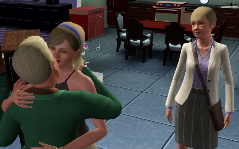
To take samoht's pictures as an example: The below pictures illustrates the idea quite well; if the girl had been in the centre of the picture, she'd occupy the whole picture and the picture would be quite bland. It may at first seem just fine, but if you think about it, you get a better depth perception and a 3d image (in your mind) of the pictured object if it's off centre. Portraits normally have the head tilted or the person just so slightly to the side for that very reason. It's not always true, but it's a great rule of thumb.

What makes samoht's above picture work though is that the picture actually has got 2 centres of attention; a couple is always two people and you won't focus on the couple as a whole. What you focus on is each one individually, but perhaps subconsciously. You get the same effect as the below picture since both of the sims involved is off centre, but the action may still be in the centre.
Manbearpig simply wants to get you. I'm super cereal. - Al Gore :)
There is no absolute truth, but the Forum Rules still come pretty close. Pay them a visit.

Bryndis

  • Guest
Re: Taking better screen shots
« Reply #12 on: October 12, 2010, 05:30:40 PM »
Lighting is definitely important.  Outdoor shots at night are the worst.  I only post those if it's something very important that I'm not controlling.

Another thing I'm trying to improve on for myself is to be more aware of the background when I'm taking screenshots.  I normally play with walls cut away, so the adjacent room is clearly visible.  When I'm taking a screenshot, I'm trying to remember to raise the walls more often.  Sometimes it's impossible because raised walls can also block the shot you're trying to take.  My living room in the Dynasty house is really quite lovely and with the walls raised it gives more realism to the shot. 

Pam, I do the same things as you mentioned--and do you ever fuss with the lighting?  I'm a stickler for outdoor lighting, atmosphere lighting, whatever.  For example, my inventor's 'den' has wall lamps that let off cyan light, but the lights near the inventing station and the time machine are red.  It makes for an awesome atmosphere; I'll have to get some good ones to share.

Ahh!  Backgrounds!  I'm insane about them.  It's probably why I like China so much; they didn't do too bad of a job on the architecture for once, and it's just so pretty.  And of course the ANGLE has to be right, so you get the right composition...  I think I'm letting my artsy-design sentiments bleed into my screenshot-taking!

Offline Saltypaws

  • Global Moderator
  • Watcher
  • ******
  • Posts: 4359
Re: Taking better screen shots
« Reply #13 on: October 14, 2010, 11:34:35 PM »
Here is another angle on a ghost and somewhat closer, I did get really close and even scared myself, lol.


I have had such good luck with photobucket.
Is it true that cannibals don't eat clowns because they taste funny?

Offline malteser60

  • Occult
  • ****
  • Posts: 467
Re: Taking better screen shots
« Reply #14 on: October 15, 2010, 06:45:18 AM »

Also, I got a tip on how to take good pictures several years ago (was it in art class?). Anyway, this is a common feature of the good pictures earlier in this thread as well, but keep whatever it is you're trying to photograph and center attention around off centre relative to the picture. Somehow this creates a more genuine atmosphere and helps the observer unconsciously focus on the right thing (apparently humans scan off the edges first).


It's known as the rule of thirds. Basically you imagine 4 lines crossing the picture each a third away from the edge. Then you try and make your point of focus along where the lines intersect. What will also help is if you can have items in the picture that will also lead your eye to the point of focus. So for examply you want to take a general shot of a centrepiece in a park you have created. A good shot will be to have the centrepiece (say it's a statue with nice plant arrangement around it) following the rule, so it will be say off centre on the left of the screenshot, and have the path leading to the statue coming from the right of the screenshot snaking it's way across the screenshot to the centrepiece. That way the path is leading your eye to the centrepiece, it balances out the overall picture, and it makes it look interesting.

For more tips just look at any photography site online (I'm only an amateur photographer but I love it!).